This session helps teams elicit the true personality, spirit, and differentiator(s) of their brand. It’s designed so that every team member’s experiences and opinions are heard, rather than personal preferences of a few stakeholders.
Done properly, Metamorphosis provides tangible brand attributes that are immediately applicable to branding. Similar versions of this are sometimes called ‘brand inception’ or ‘brand values’ sessions.
Requirements
- A product or organisation with its builders or members in general agreement about its values.
- 1–2 moderators.
- Participants, including key organisational stakeholders.
Method
Metamorphosis is made up of three design studio exercises that last about 20 minutes each. Try to do them sequentially and in the same session.
1. Make transformations
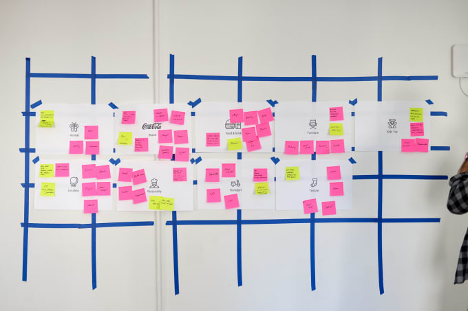
Have every participant spend two minutes writing on sticky notes answers to the following question: ‘if our brand were X, it would be Y’. These answers doesn’t have to be concrete. In fact, the looser they are, the easier the subsequent exercises are.
Do this for some or all of the following categories:
- Furniture
- Animal
- Brand
- Food or drink
- Kids toy
- Location
- Personality
- Mode of transport
- Texture
- Weather or season
- Public figure
- Car model
- Outfit
- Restaurant
- Flavour
- Musical instrument or genre
- Architectural or artistic style
Sticky notes can go up as they are created, or at the end of the 20 minutes. It depends on whether you want to encourage idea-riffing or encourage originality, respectively.

2. Surface themes
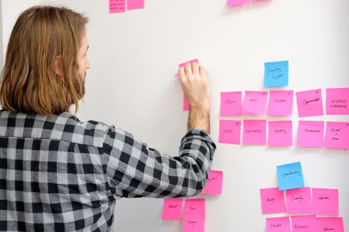
Spend a few minutes as a group observing and clarifying the results of the prior step. The moderators should take fresh sticky notes and collect similar ideas into high-level themes. Confirm these themes with participants, and then lock them in by giving each a name.
Example: sticky notes (taken across categories) such as ‘warm’, ‘dependable’, ‘wise’, and ‘role-model’ might be collected in a theme called ‘Guiding Light’.

3. Define brand attributes
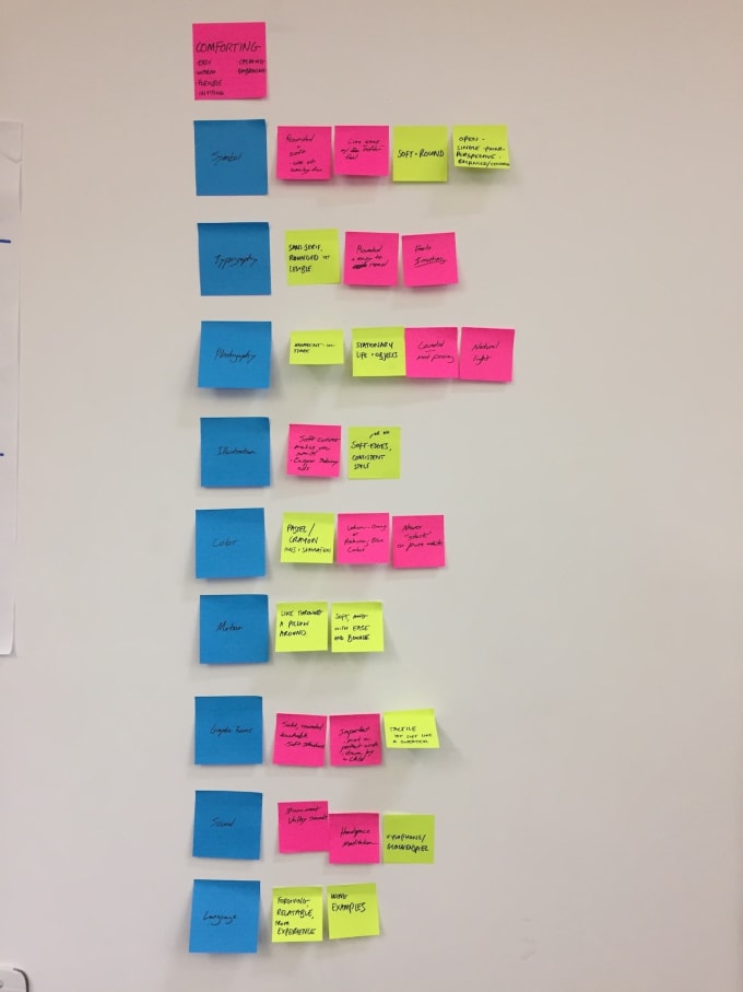
Create tangible attributes under the following areas for each of your new themes:
- Symbol
- Typography
- Photography
- Illustration
- Colour
- Motion
- Graphic forms
- Sound
- Language
Stop when you feel attribute additions slowing or becoming worse in quality. Play back the attributes to the group to make sure they resonate. It’s much harder to deviate later on if you’ve all previously agreed on the guardrails.

Next steps
What you do after the above exercises varies for the desired output. For most visually-orientated outputs (such as visual brand identity) the next step is often a moodboard for each theme, informed by your new brand attributes.
Credits
Jason Gregory and Chris Marotta introduced me to a version of this session whilst I was at ustwo NYC. Chris and I in particlar worked on multiple projects that made use of some or all parts. The photo here were from our work with the New York City Mayor’s Office that eventually became Growing Up NYC.