Campsites in bushfire-prone Western Australia often have this sign at their entrance:
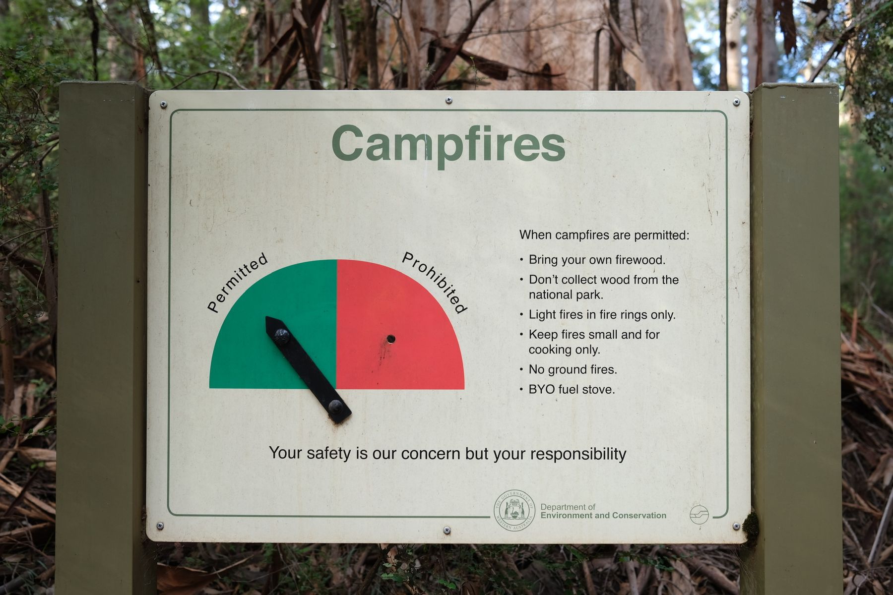
It’s like someone said “omit needless words” to the omnipresent, country-wide, Fire Danger Ratings sign. Here’s what that ones look like:
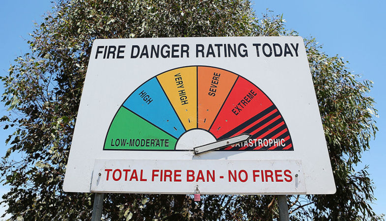
I’m still thinking about that campfire sign, but not because of its sparseness. I’ve since realised analogue dials are dying off. Seeing one has become novel.
Switching from analogue to digital is generally considered a no-brainer for public infrastructure and consumer goods. Think electricity meters, speedometers, or pressure gauges. I don’t think I’ve ever questioned one of these advances until now.
How much are we losing from this presentation switch? I’d argue a fair bit. Particularly when it comes to affordances.
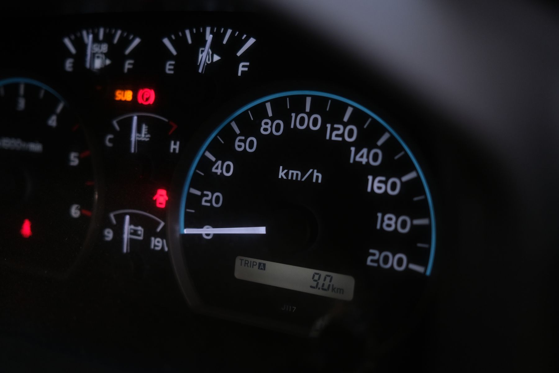
Consider the humble analogue speedometer:
…against its replacement in newer cars:
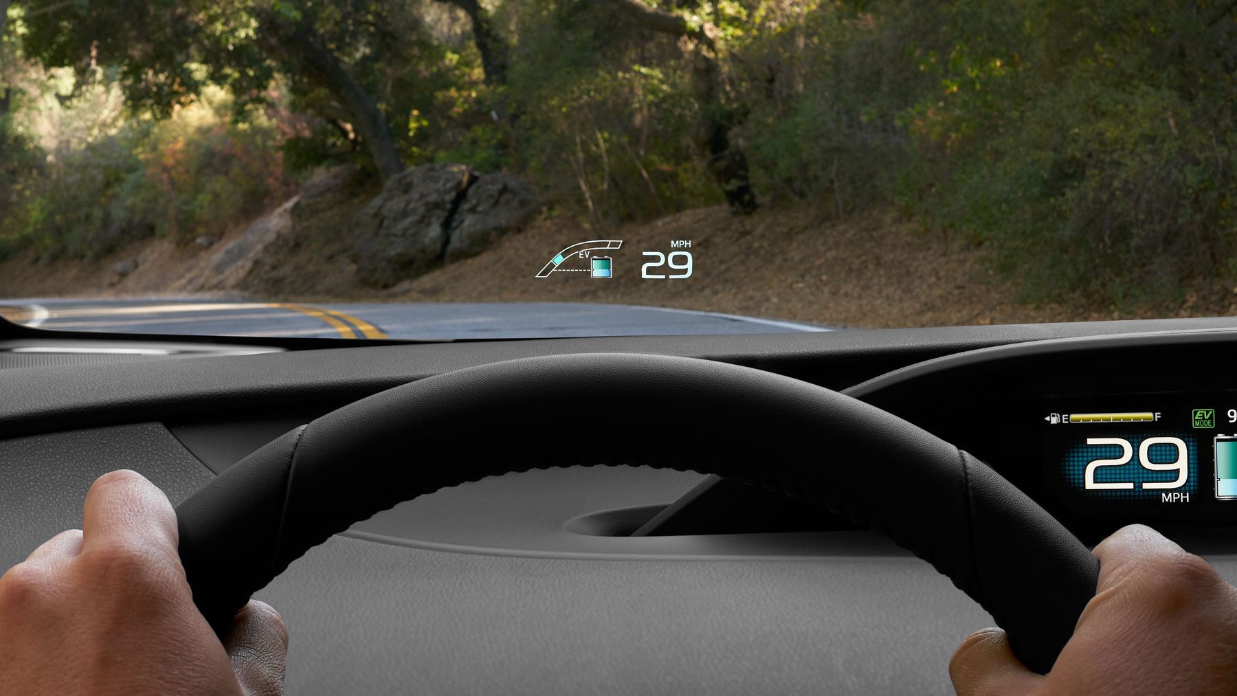
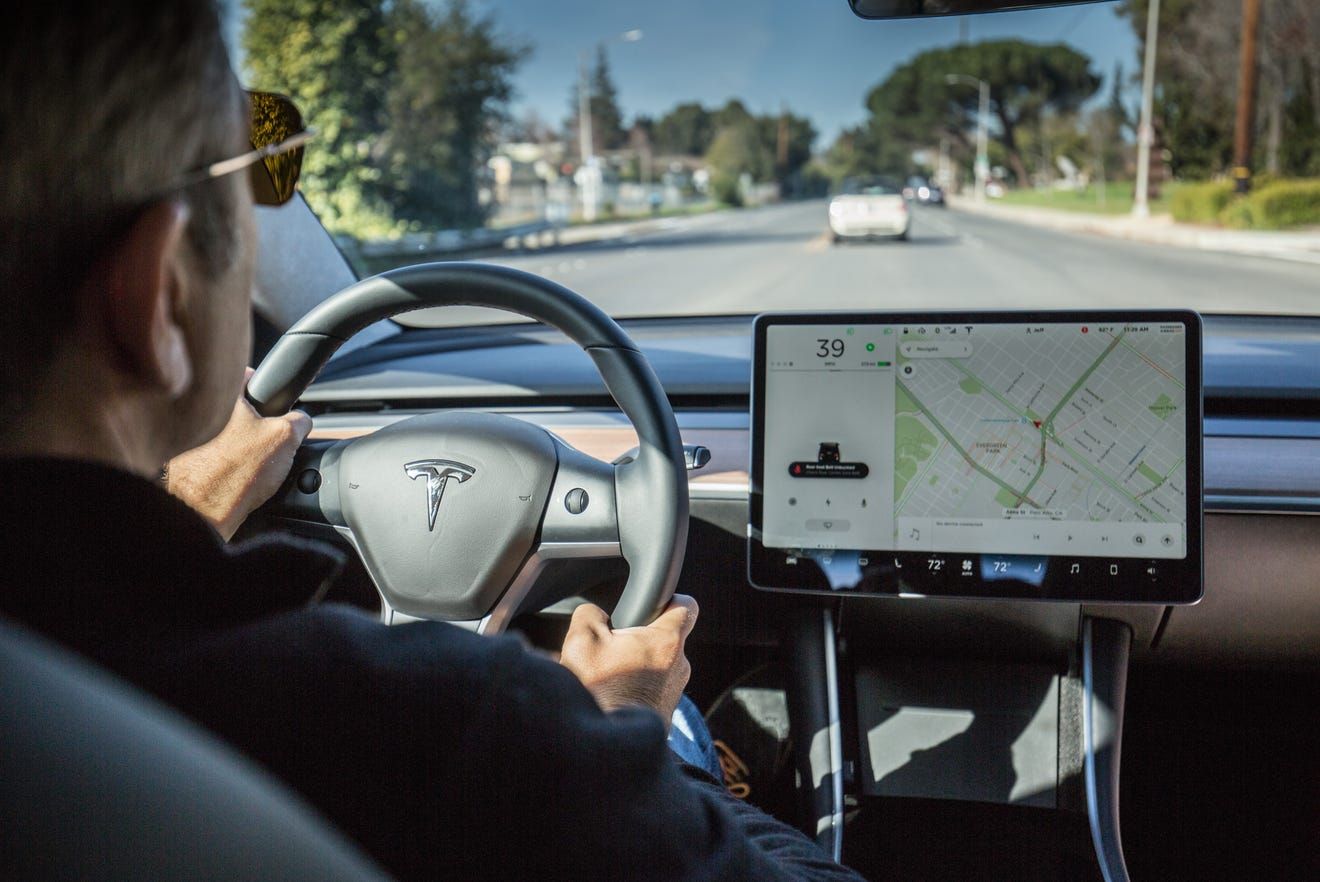
You get the gist: digital digits over dials and panels.
I can’t help but think that the designers have thrown the baby out with the bathwater; reintroducing the numerical data but none of the contextual affordances.
Bounds
Did you know that a square drawn on the ground will entice cats to sit within its bounds? I’m more of a dog person so here’s another one: my beagle, Sally, hated car trips. She’d only cooperate if a sturdy cardboard box was brought along for her to curl up in and feel control over.
A speedometer similarly provides bounds by describing how fast we can go and how far away that is from a stationary position.
Bounds give us a definitive start and end point; they orientate us (and comfort us).
Shape
“29 MPH” means nothing to me as a non-American. Is that fast? Slow? An analogue speedometer needle at that position however (between around 8 o’clock and 10 o’clock) tells me that the same position in km/hr tends to be what I drive in metropolitan areas, so it must be around 50 km/hr.
Shape within bounds provides visual cues.
Range
Reacquaint yourself with the campfire sign from earlier. Now imagine your conversation with a National Park ranger if you were caught with a fire as the needle was pointing to Prohibited. No ifs or buts: you’re clearly in the wrong. Now imagine if the sign were more like the Fire Danger Ratings one: it’s not so clear anymore.
Range tells us the amount of steps within a set of bounds; how much something is on a spectrum or if its a binary choice.
I wonder if these affordances apply beyond numerical data that’s traditionally represented on a semicircle. Do their principles apply? Are there different ones?
One medium that comes to mind is the “next stop” panel on trains; I’d always breathe a bit easier when travelling on the Subway’s G and J lines, which were visually map-based compared to the others’ text.